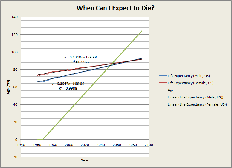
 I spent a few minutes calculating my expected date of death today since I just turned 45. It turns out that I am beyond the half-way point in this journey. I’ve created a spreadsheet that you can use to calculate your own demise and produce charts like the one above. The current spreadsheet uses the US Male/Female mortality numbers from the World Bank dataset and then a linear regression for future gains in life expectancy. Other country sets can be easily incorporated.
Enter your year of birth in the yellow box and it will create a plot of how long you can expect to live, as well as the transition point from green to red in your, eh, lifecycle. Don’t forget to get your trusts, wills, organ donations, and directives in order.
Of course, there are no more compelling lies than statistical ones, and yet there are no other ways to guess the future than to extrapolate from the past.… Read the rest